The Alphabet Selector Component
If you’re ever worked with a Dynamics/Model Driven App before, you know it has many different ways to filter data out-of-the-box. One of these features is the “jump bar”. This component allows users to quickly “jump” to records based on the starting letter. For canvas apps however, there isn’t a built-in solution like this.
I built a reusable component that mimics the jump bar behavior while also allowing for responsive design in desktop and mobile form factors.
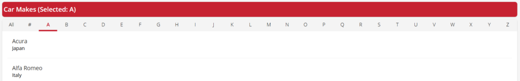
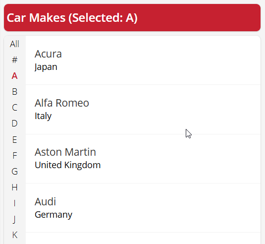
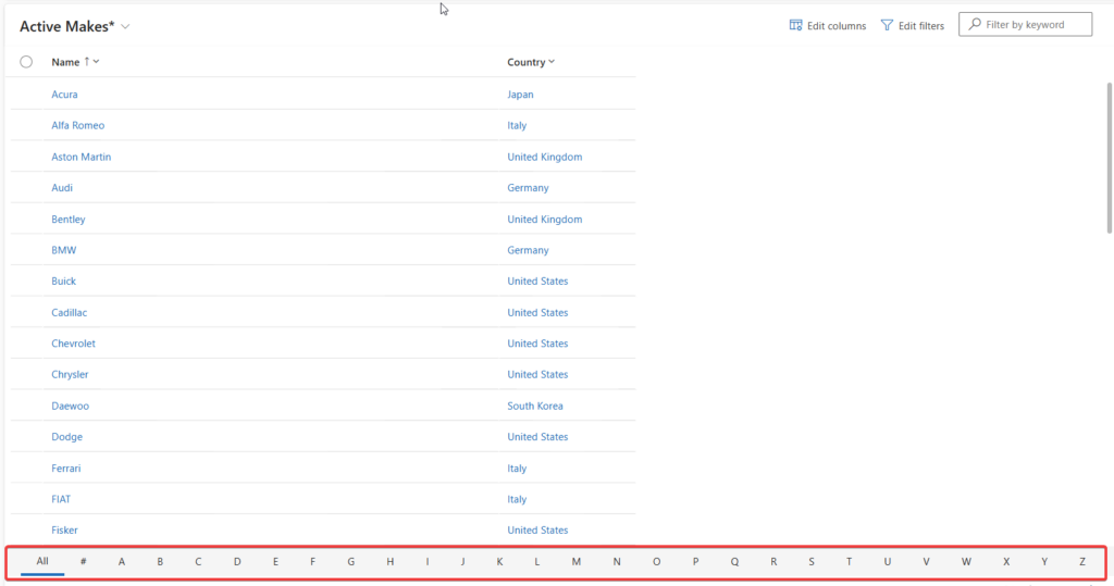
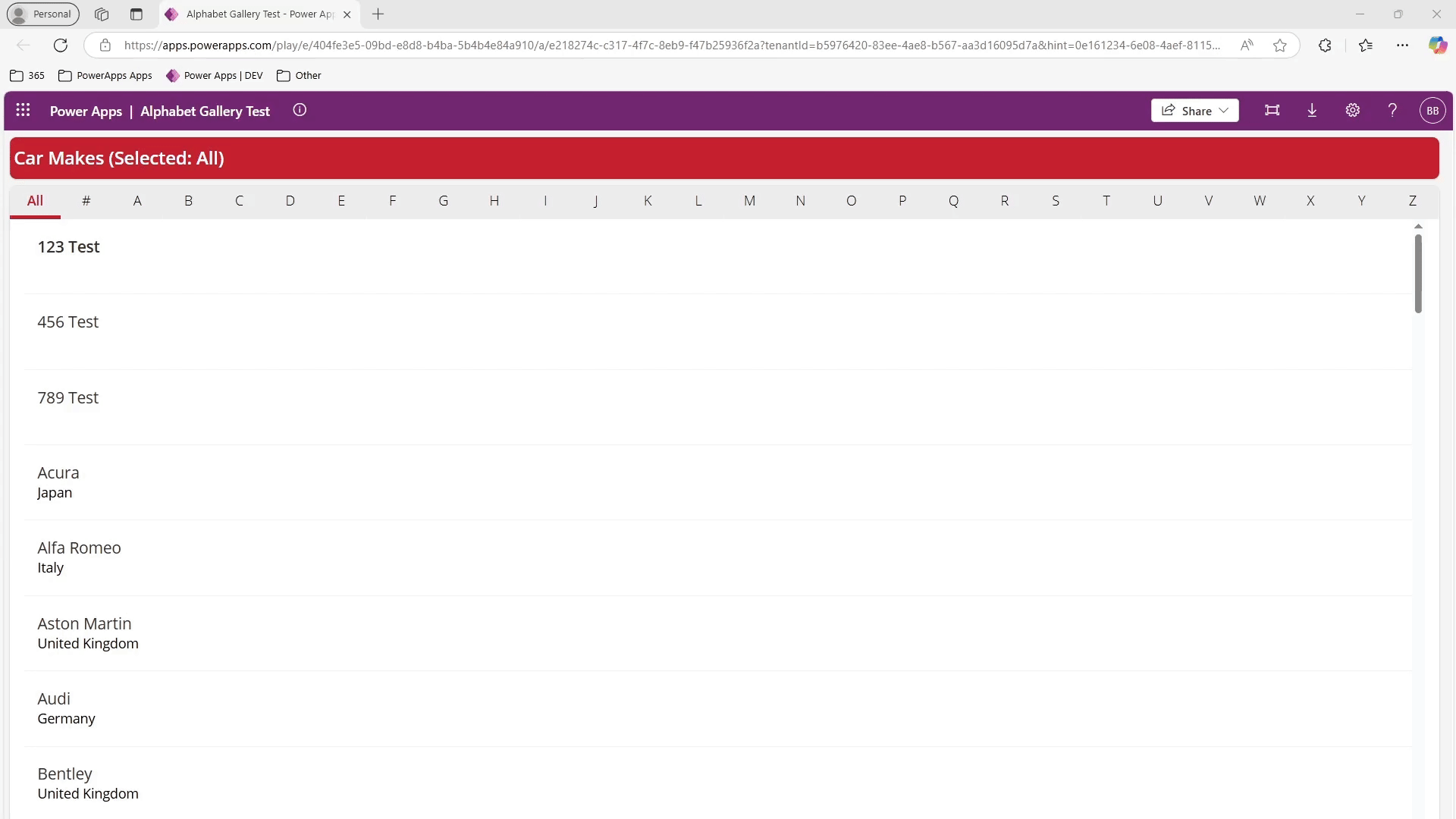
In the example above, I am filtering a list of Auto Manufacturers which starts with the first letter of it’s name. The functions Filter, StartsWith, and Or PowerFx are used. If the user selects “All” or no option is selected, show all items, else we use the StartsWith function on whatever letter or number the user selected.
Configure Gallery Filtering
Here’s how that formula looks in the items property of the gallery:
Sort(
    If(
  cmp_AlphabetGallerySelector_1.SelectedLetter = "#",
        Filter(
            Makes,
            Or(
                StartsWith(
                    Name,
                    "0"
                ),
                StartsWith(
                    Name,
                    "1"
                ),
                StartsWith(
                    Name,
                    "2"
                ),
                StartsWith(
                    Name,
                    "3"
                ),
                StartsWith(
                    Name,
                    "4"
                ),
                StartsWith(
                    Name,
                    "5"
                ),
                StartsWith(
                    Name,
                    "6"
                ),
                StartsWith(
                    Name,
                    "7"
                ),
                StartsWith(
                    Name,
                    "8"
                ),
                StartsWith(
                    Name,
                    "9"
                )
            )
        ),
        Filter(
            Makes,
            Or(
                StartsWith(
                    Name,
                  cmp_AlphabetGallerySelector_1.SelectedLetter
                ),
cmp_AlphabetGallerySelector_1.SelectedLetter = Blank(),
  cmp_AlphabetGallerySelector_1.SelectedLetter = "All"
            )
        )
    ),
    Name
)
The StartsWith function is delegable, allowing pagination of large datasets in sources like Excel, SharePoint, Dataverse, and SQL Server. You can also disable the ability to filter by numbers. If you do that, then the formula would look like this:
Sort(
    Filter(
        Makes,
        Or(
            StartsWith(
                Name,
                cmp_AlphabetGallerySelector_1.SelectedLetter
            ),
            cmp_AlphabetGallerySelector_1.SelectedLetter = Blank(),
            cmp_AlphabetGallerySelector_1.SelectedLetter = "All"
        )
    ),
    Name
)
Using a Container for Responsive Design
As mentioned, the component adheres to responsive design principles. If you want to place it inside a responsive container, you’ll need to make a few additional property updates.
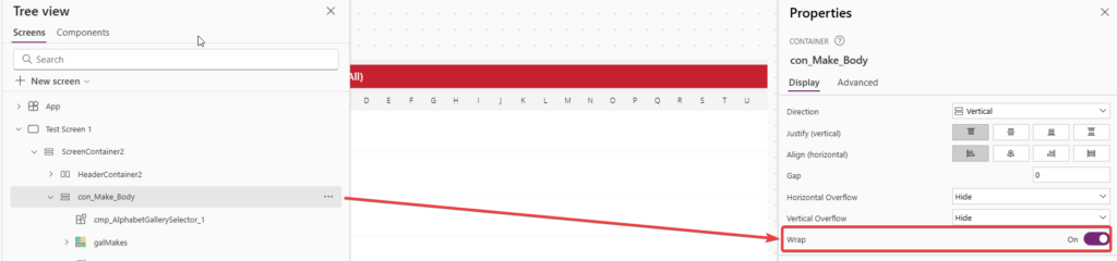
Here, I have placed my component within a vertical container at the top. Be sure you also enable the wrap property on this container:
Change the component’s width and height to the following:


Finally, to make the “Orientation is Vertical” property to adjust the orientation, we will base it on the current screen size:

For this technique to work, the component will need to be at the top of the container so it wraps the gallery to the left in mobile (1) or tablet size (2).
If you aren’t concerned with showing the component vertically, consider setting the visibility to false when the Screen Size is 1 or 2. You can then place it at the bottom or wherever in your container order. The jump bar with Model Driven Apps also didn’t show in mobile experience.
Get this Component
You can download the component and import it into your own component library by finding it on my GitHub.